Analysed coins
| Coin catalogue section: | Pseudo-Kelenderis Mints |
| Coin corpus dataset: | Pseudo-Kelenderis Mints |
The number of analysed coins is given in Table 1. Coins whose weight is unknown or unreliable, or that are excessively corroded or damaged, are excluded from the analysis.
| Corpus | Number of coins as of 27 September 2026 | ||
|---|---|---|---|
| Total | Excluded | Analysed | |
| Pseudo-Kelenderis mints | 25 | 2 | 23 |
Table 1: Number of analysed coins
Analysis
Box plots1 and descriptive statistics of Types 1 and 2 are presented in Figure 1 and Table 2, respectively. Coin Ref. No. PK1002 is distinguished from the other coins by its very low weight of 9.84 g. However, according to the photograph in the auction catalogue, it appears to be well preserved and to show no signs of metal degradation; it was therefore not excluded from the weight analysis.
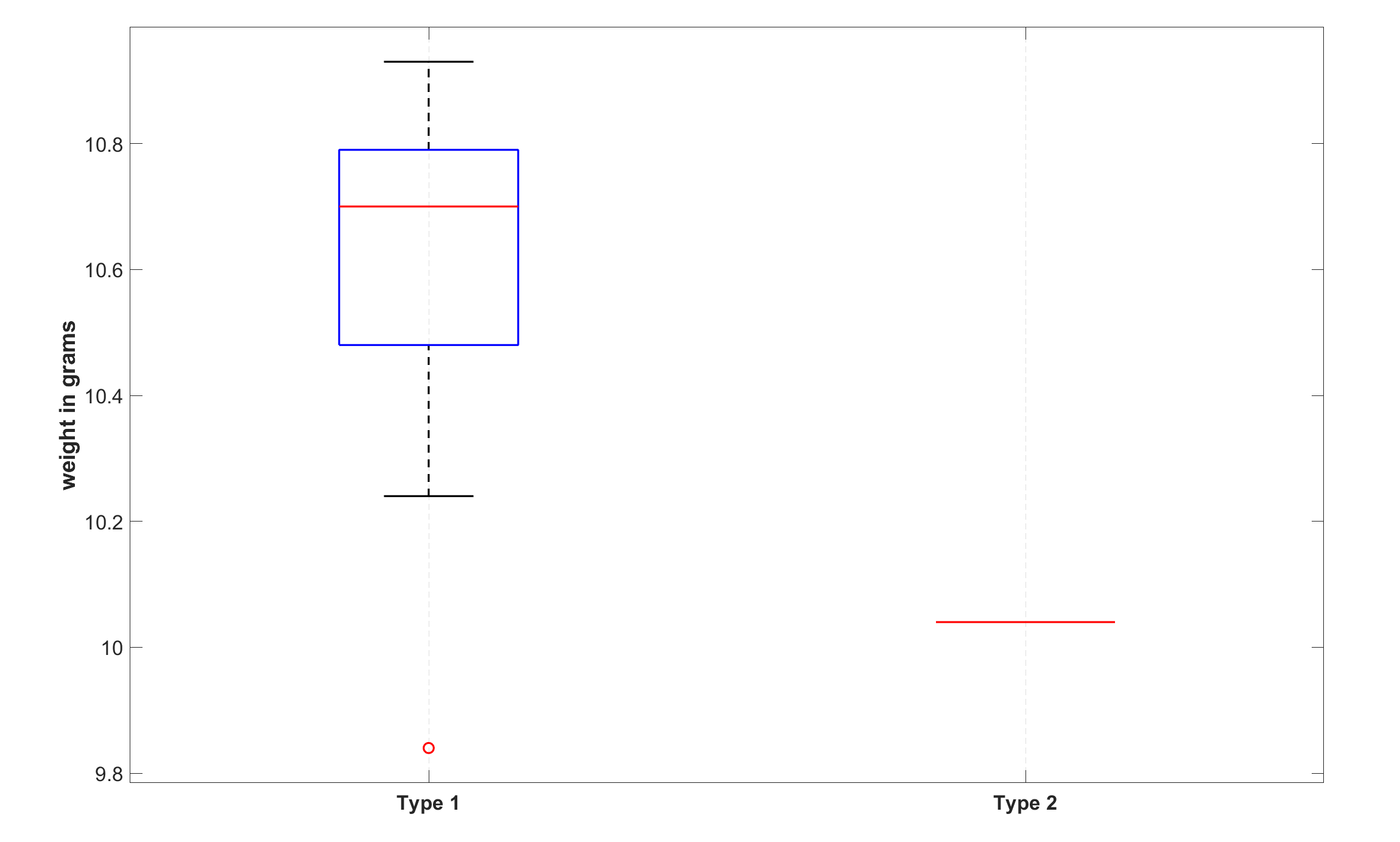
Figure 1: Box plots
| Statistics | Type 1 | Type 2 |
|---|---|---|
| Number of coins: | 22 | 1 |
| Mean: | 10.59 | 10.04 |
| Standard deviation: | 0.29 | |
| Interquartile range: | 0.33 | |
| Skewness: | -1.20 | |
| Kurtosis: | 3.68 | |
| Minimum: | 9.84 | |
| 25th percentile: | 10.46 | |
| Median: | 10.69 | 10.04 |
| 75th percentile: | 10.79 | |
| Maximum: | 10.93 |
Table 2: Descriptive statistics
Figure 2 presents the relative frequency histogram of Type 1. The bars represent the relative frequencies of weights from 9.80 to 11.00 g in increments of 0.10 g, while the weight of the only known specimen of Type 2 is represented by the red circle on the horizontal axis. The cumulative distribution of Type 1 is shown in Figure 3, where the weight of the single specimen of Type 2 is again represented by the red circle on the horizontal axis.
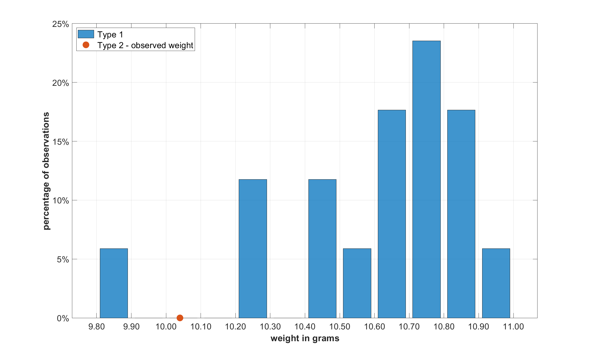
Figure 2: Relative frequency histogram
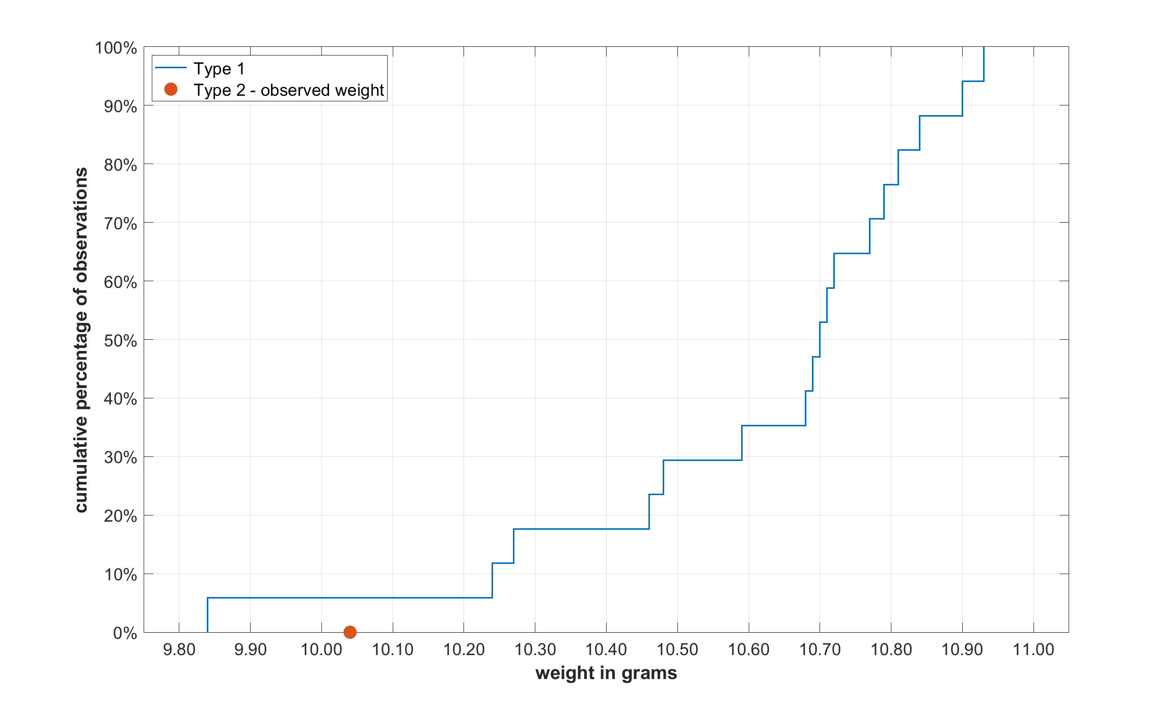
Figure 3: Cumulative distribution
1The bottom and top of each box are the 25th and 75th percentiles of the dataset, respectively (the lower and upper quartiles). Thus, the height of the box corresponds to the interquartile range (IQR). The red line inside the box indicates the median. Whiskers (the dashed lines extending above and below the box) indicate variability outside the upper and lower quartiles. Above the upper quartile, a distance of 1.5 times the IQR is measured, and a whisker is drawn up to the largest observed data point in the dataset that falls within this distance. Similarly, below the lower quartile, a distance of 1.5 times the IQR is measured, and a whisker is drawn down to the smallest observed data point in the dataset that falls within this distance. Observations beyond the whisker length are marked as outliers and are represented by small red circles.
2 April 2022 – 27 September 2026